
This photo backdrop from backdrop Warehouse would be ideal on my layout, but the prices are "sky high."
The first step I took in researching this problem was to hit all of the model railroad forums I frequent, such as TrainBoard.com and the Model Railroader forums at Trains.com. By searching existing threads, I was able to find posts--many with numerous photos--describing how other modelers crafted their backdrops. Another reliable source for scenery information is Model-Trains-Video.com, which contains an entire video series available on DVD or dowloadable MPEGs that details the scenery techniques used to create Joe Fugate's HO-scale SP Siskiyou Line layout. After visiting these sites, I settled on a sky painting technique that basically involved applying a sky blue color to the entire backdrop and then airbrushing in some white along the bottom of the backdrop to simulate the lighter sky color at the horizon.
Right after I settled on this technique, I saw an advertisement in Model Railroader for a new book in the Kalmbach Publishing how-to series titled Painting Backdrops for Your Model Railroad. As luck would have it, I found this book in stock upon my next visit to the local hobby shop so I purchased a copy. The book was written by Mike Dannemann, who is currently constructing an N-scale layout depicting the Rio Grande in the Colorado Rockies. His backdrops are spectacular and he shares his techniques in an easy to understand step-by-step format. Even better, each chapter focuses on how to paint a backdrop for a particular region in North America, including the hills and mountains of the eastern United States that will be included on my layout. This is an excellent book and I highly recommend it, both for its highly informational content and its inspirational "eye-candy" format. After reading this book, I made two decisions. First, I now plan on painting specific features such as clouds and detailed tree covered hillsides on my backdrop, something I would not have previously considered. Second, rather than airbrushing white onto the lower backdrop, I will use a lighter shade of blue paint feathered in with a brush to simulate the lighter horizon.

This book is an excellent resource for model railroad backdrops and has dramatically influenced the way my backdrop will be painted.
Although all of this research managed to refine my backdrop strategy, it still did not answer my original question: which shade of blue do I use for the sky? In fact, not only did I not settle on a single color, but I now needed two colors of blue to complete my sky backdrop! To pick these colors, I first collected lots of paint samples from the local paint departments. I then took these outside on a clear sunny afternoon and held them up with the sun at my back. This allowed me to eliminate all but a few shades of blue, and I took these remaining samples to the basement and viewed them under the layout lights. I also brought down prints of several photographs that I have taken while railfanning my prototype railroad, the CSX in north Georgia. This allowed me to settle on a single shade of blue for my primary sky color: Horizon Haze, which is available in the lineup of Behr paints from The Home Depot.
With the primary sky color finally determined, I now had to select a lighter shade of the same blue for the lighter sky along the horizon. This would be a much easier process, since you can pretty much just go to the rack of paint samples at The Home Depot and pick the card that has the lighter shades of colors in the same color group. For example, the shade named Horizon Haze is on the paint card numbered 540B: the 540 is the basic color group and the letter B indicates these are the second lightest shade of colors in the group (A would be the lightest; Z would be the darkest). So I picked up the 540A sample card and looked at the colors. But out of the three colors on sample card 540A, which one would be best to use for the horizon color? I wanted to make sure I picked one that was not too light, but light enough so there would be a noticeable difference between the two shades of blue.
To make this determination, I did a search to see if I could find samples of the Behr paint colors on the web. Sure enough, the Behr website has a nifty little feature called ColorSmart that allows you to explore and play around with all of their colors online. Using this feature, I was able to get swatches of my colors into my Macromedia Fireworks graphics application. Using these colors, I was able to select a color that best complemented the Horizon Haze shade of blue to produce a nice sky. The color I chose as the lighter blue is named Niagra Falls. To make this determination, I made a mock-up of a sample backdrop scene using Fireworks.
Backdrop Mock-up
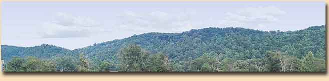
I started with a photo that I took in north Georgia (where my prototype CSX is located) on a clear sunny day:

Next, I used Fireworks to remove the sky from this photo:

Using Fireworks, I created a plain sky background using my darker shade of blue (Behr 540B-4 Horizon Haze) at the top blended into my lighter shade of blue (Behr 540A-2 Niagra Falls) at the bottom along the horizon:

Finally, I overlaid the foreground scenery from the actual photo over the simulated sky using my selected paint colors and--voila!--I had my perfect sky:

If you look at the original photo and my mock-up side by side, you will notice that my sky colors are a tad lighter than those actually photographed, although they were surprisingly pretty darn close. This is because every commentary on backdrop sky colors I have read recommends choosing a shade or two lighter than what looks ideal, since latex colors will dry darker when they are actually applied to the backdrop. Overall, I am very happy with the selection of these colors and feel confident moving forward that my backdrop will have a realistic appearance, even if I just stick with the basic wild blue yonder.
.


